The best practice of email design Part 1: Your checklist for more engaging email campaigns
Hey- if you’re reading this article, you must be a designer in a studio working on some client request. Or you might be a marketer who is about to execute your business idea for the next campaign run. Whether you have been part of the entire development process along with EDM developer and consultant or not, there are still some limits that you will face throughout the execution of your project. Rest assured, though. I am here for you to give some guidance.
Executing email campaigns can be very stressful. Especially because you can’t revert your email like in a blog post or word document that you would share with your colleagues. So here are some tips to help you with your email campaigns based on our many years of experience.
1. Follow the character limits provided by the developer who builds the template.
While I do understand there are so many things you like to talk about. However, when there are too many words in your email and it is becoming excessive, it won’t bring good results. The long article will cause your audience to lose interest in reading further. Plus email has a minimal place on the character limits, not officially telling you upfront but Gmail considers any emails with an HTML file size over 102 Kb to be too long. Your beautifully written story will most likely cut off, or I would say clipped off by Gmail.
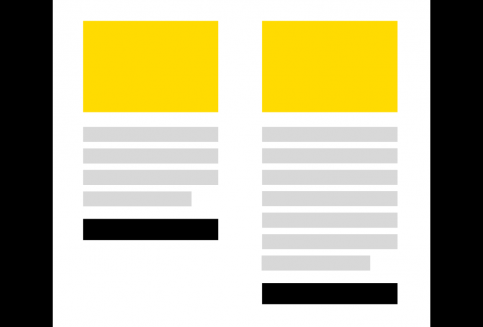
If you don’t follow the character limits on your email, you may also see a difference in height (picture above) – which is not a huge problem but some clients might not be happy about the alignment of buttons.

If you don’t follow the character limits on your email, you will also see the height different like this (picture above) – which is not a big problem but some clients seems a bit agitated by the alignment of buttons.
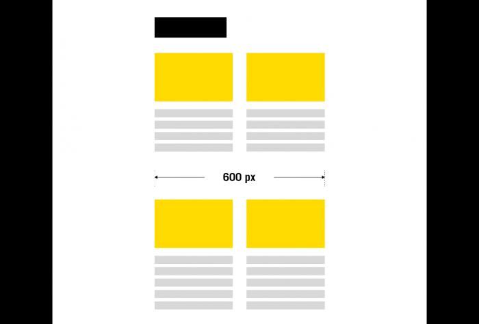
2. Have a maximum width for your content of 600 px (recommended)
600px wide the safest maximum width for your desktop design to ensure users won’t have to scroll horizontally. Therefore we also choose the media query screen bar on 480px instead of 600px. Your email maximum contents are already set to be 600px. So what is the point of setting the responsiveness triggering on wider than 600px? Well firstly, setting min-width on 450-480px is the safest bet. There is an article on Litmus blog which claims that 600px email width is a myth, but I disagree. In fact, there are more width options across multiple email clients. However, it doesn’t explain why 600px is not the most optimal option even though the email clients and screen resolution have evolved over time, the tradition of staying within 600px has never gone wrong.

3. HTML emails use a nested table. TABLE
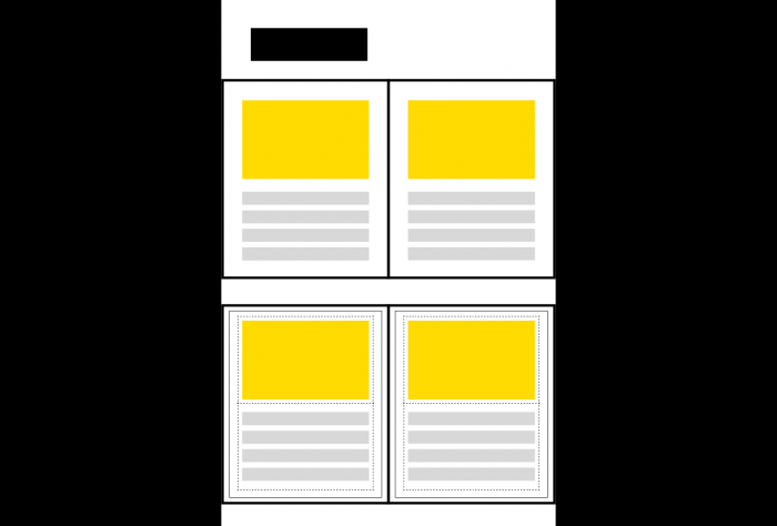
Make everything into a very rigid grid-like your Lego assembling. Try to avoid having too many vertical divisions. Remember- simple is the best discipline on design. There are lots of articles that encourage us to use more advantageous forms. From years and years’ experience, I started questioning if those writers actually ever tested their template on 5-6 different devices after testing an email on acid or litmus. In the real scenario, when the grid was not precisely square tiled without consistency, it was always broke down in the actual testing phase.

Top: This is what normally the audience would think of how the grids would be composed of
Bottom: This is how the grids are actually formed under the hood.
4. Simplicity is the best practice.
Try to be concise, stay in a hierarchy flow; keep it clear. Have you heard of the phrase ‘Less is more’? This phrase exists perfectly for email, mainly. Don’t get swayed by the UX blogs who never write any testable email by themselves. When the design is not excusable, We wouldn’t call it a design. Simplicity is the most optimal sophistication that saves your time and possible billable money as well.
5. Use Pixels. No other units
I’ve worked with a lot of designers who handed in their sketch file and zeppelin file that converts pt. to the pixel. Geez!. There is nothing wrong with designing with Sketch, but pt. is not a measuring unit in web digital. You can’t complain that our build is not a pixel-perfect while your design base was essentially on point base. Also, in the digital field, the ratio-based design should be the standard of your aesthetic grid rules.
Any web-based design should not be oriented by the hypothetical term ‘Pixel-perfect’. I will publish another post on why ratio endurance should be the priority rule on digital design in another article.
6. Many email clients don’t support background images.
Rather than having a background image and having floating text boxes in the middle, try to pack them up into one hero image.
7. Image and fonts should be uploaded to the server where email is dispatched.
Anything outside of its own domain source, the assets linked to email would be blocked by cross-origin regulation. The digital assets outside of the email dispatch service provider server are highly likely to be blocked.
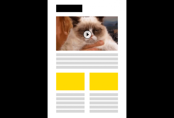
8. No gif or video if possible.
The email clients have their file size limits to render along with the ESP system’s dispatch limits.
We are not talking about the attachment on emails. It’s about the email itself. Putting a video or gif will hugely add up file size on your initial email

9. Only use web-safe fonts if possible.
If you want to bring web fonts, we can put the web fonts in your campaign email. Although, non-web safe fonts would be most likely scratched off on Outlook. By the way, what is web-safe font? Web-safe fonts are the default fonts across the different operating systems and devices.
Here is the full list of the web-safe font: https://www.w3schools.com/cssref/css_websafe_fonts.asp
We are not finished yet. There are so many things we have considered when designing for email.
The nine tips that I provide here will give you a quick and solid start. I will get a part 2 ready in this series. Please stay tuned to more posts. Happy campaigning.
Gyuri (Marketing Experience Developer)
For support on your EDM design and build requirements, please reach out to Helium anytime (email: personalisation@iamhelium.com.au)